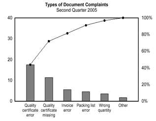
A Pareto chart is used to graphically summarize and display the relative importance of the differences between groups of data. A Pareto chart is a bar graph. The lengths of the bars represent frequency or cost (time or money), and are arranged with longest bars on the left and the shortest to the right. In this way the chart visually depicts which situations are more significant.
When to use:
• When analyzing data about the frequency of problems or causes in a process.
• When there are many problems or causes and you want to focus on the most significant.
• When analyzing broad causes by looking at their specific components.
• When communicating with others about your data.
Procedure to use:
1. Decide what categories you will use to group items.
2. Decide what measurement is appropriate. Common measurements are frequency, quantity, cost and time.
3. Decide what period of time the chart will cover: One work cycle? One full day? A week?
4. Collect the data, recording the category each time. (Or assemble data that already exist.)
5. Subtotal the measurements for each category.
6. Determine the appropriate scale for the measurements you have collected. The maximum value will be the largest subtotal from step 5. (If you will do optional steps 8 and 9 below, the maximum value will be the sum of all subtotals from step 5.) Mark the scale on the left side of the chart.
7. Construct and label bars for each category. Place the tallest at the far left, then the next tallest to its right and so on. If there are many categories with small measurements, they can be grouped as “other.”
Steps 8 and 9 are optional but are useful for analysis and communication.
8. Calculate the percentage for each category: the subtotal for that category divided by the total for all categories. Draw a right vertical axis and label it with percentages. Be sure the two scales match: For example, the left measurement that corresponds to one-half should be exactly opposite 50% on the right scale.
9. Calculate and draw cumulative sums: Add the subtotals for the first and second categories, and place a dot above the second bar indicating that sum. To that sum add the subtotal for the third category, and place a dot above the third bar for that new sum. Continue the process for all the bars. Connect the dots, starting at the top of the first bar. The last dot should reach 100 percent on the right scale.
Example:
Figure shows how many customer complaints were received regarding the product document.
If all complaints cause equal distress to the customer, working on eliminating document-related complaints would have the most impact, and of those, working on quality certificates should be most fruitful.
No comments:
Post a Comment